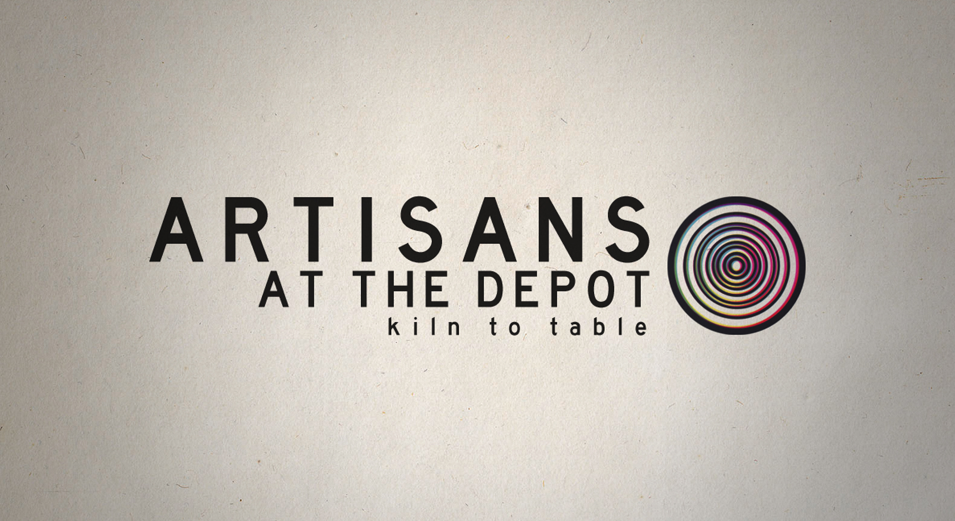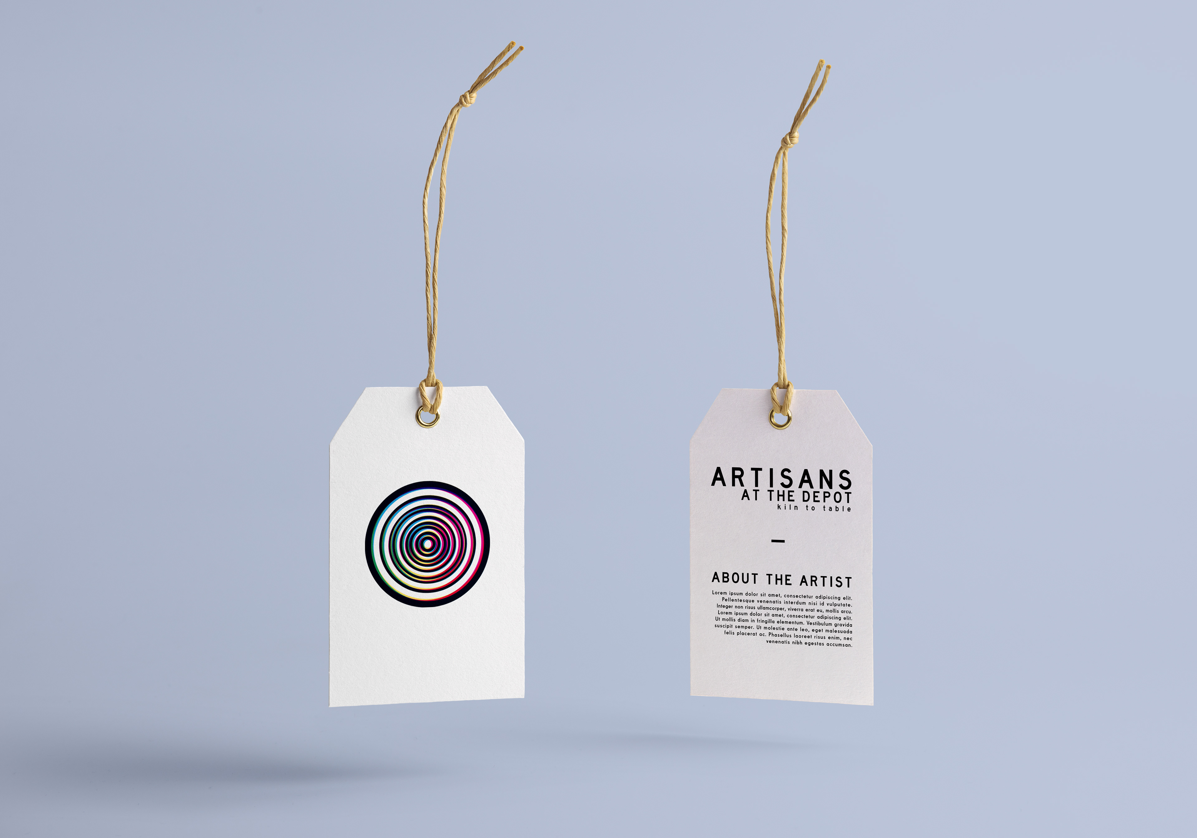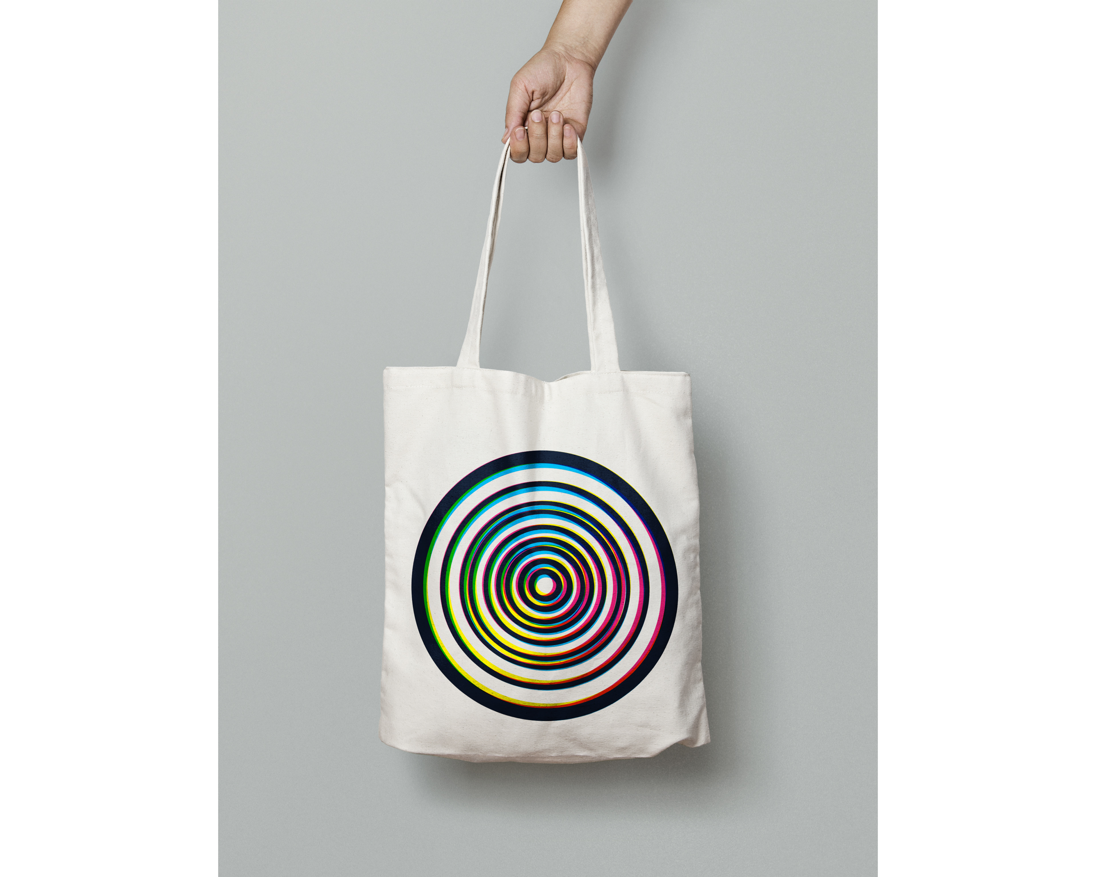
Artisans at the Depot was a collaborative event of design, ceramic, and culinary arts put on by the University of Arkansas in December 2016 through Design for Good. Each graphic design student was given the opportunity to develop a brand for the event.
As the event represented a merging of the culinary, ceramic, and graphic arts, I wanted to combine visual aspects of each without them appearing too pronounced. The mark is made to resemble a potter's wheel. Cyan, magenta, yellow, and key or black (CMYK) represent a color model used for color printing in graphic design, so I used this color palette to make a nod to the graphic design element of the event. To complement the Japanese menu for the evening, I chose a typeface and letter spacing reminiscent of what is often used in Japanese graphic design.