Overview
Jori's Home Essentials
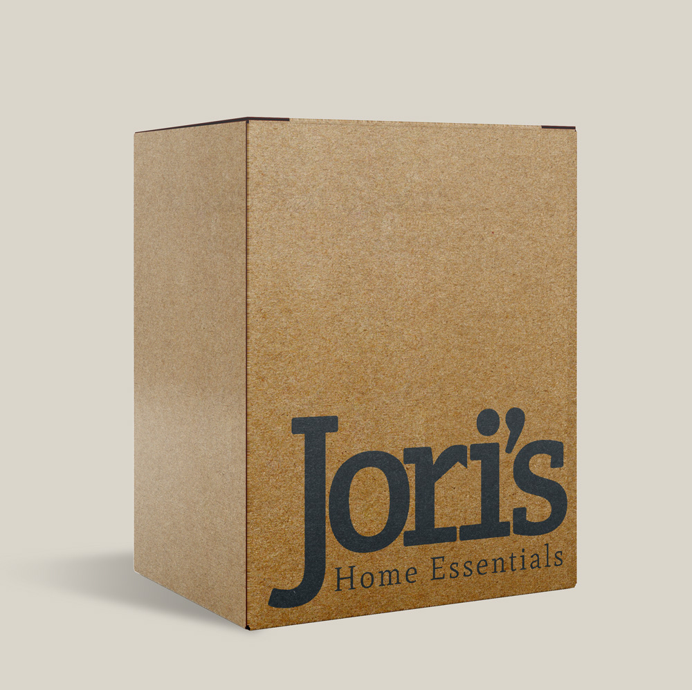
Jori’s Home Essentials is an online shop for home decor, accent furniture, kitchen essentials, and more. It offers unique items which can't be found in big box stores. While it has a wide selection of styles, rustic and farmhouse-inspired products are its specialty.
The Problem
Jori's Home Essentials was an emerging business in a highly competitive industry. Although it had a website and a social media presence, it didn't stand out from its competitors visually.
The Approach
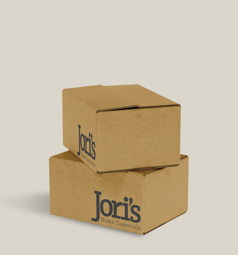
I worked with Jori's Home Essentials to realize the brand's personality and create a meaningful, memorable logo and identity system which would distinguish it from competitors.
Logo
Brand Personality
In order to create a meaningful logo, I worked with Jori's Home Essentials to chisel out the brand's personality. We established it had the following characteristics:
Masculine / Feminine
Youthful / Mature
Simple / Intricate
Quiet / Loud
Approachable / Authoritative
Luxury / Economy
Fun / Serious
Professional / Casual
Modern / Traditional
Playful / Elegant
Extreme / Safe
Identity
Rustic + Modern
Jori's Home Essentials' visual identity draws inspiration from the brand's personality as well as the rustic charm of its products. Crete Round, the slab serif typeface, evokes feelings of modernism, simplicity, affability, and notes of femininity. Conversely, Mate, the old-style serif typeface, communicates feelings of traditionalism, elegance, formality, and dependability.
The neutral, warm color scheme is harmonious with the minimal, rustic style of JHE’s catalog. Dark navy and copper are complementary colors that elicit similar dualities to those conveyed by the logo’s typography. Furthermore, the muted tones and white space allow products to shine without the brand fading from focus.


Deliverables
Logo
Identity System
Brand Manual
Skills Utilized
Logo Design
Typography
Color Theory
Illustration
